Friday, December 20, 2013
Thursday, December 12, 2013
Tuesday, December 10, 2013
Line and Its Effects
WALLPAPERS:
Vertical Line: I would use this wallpaper in a kitchen/bathroom/dining room.
Curved Lines: I would use this wallpaper as an accent wall in a bedroom or rec. room of some sort.
Vertical Line: I would use this wallpaper in a kitchen/bathroom/dining room.
Curved Lines: I would use this wallpaper as an accent wall in a bedroom or rec. room of some sort.
Friday, December 6, 2013
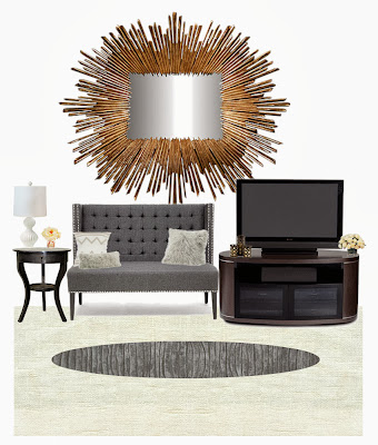
EMPHASIS: Mirror(s)
The emphasis was supposed to be on the mirror so I made the rest of the room with more muted, less noticeable colors and got the mirror that was bright, gold and shining.
Monday, October 14, 2013
Color Schemes in the Home
Monochromatic Color Scheme:

This room is a green monochromatic color scheme, with mixed in whites, browns, and blacks. The 3 other colors thrown in are the neutrals that give your eyes a rest. A monochromatic color scheme has a calming affect on the mind. You would use this in a place where people should be calm and at peace.

This room is a green monochromatic color scheme, with mixed in whites, browns, and blacks. The 3 other colors thrown in are the neutrals that give your eyes a rest. A monochromatic color scheme has a calming affect on the mind. You would use this in a place where people should be calm and at peace.
Analogous Color Scheme
This color scheme is analogous. Analogous colors blend harmoniously because they are generally related to each other. They are also related to each other in position on the color wheel. They usually have less contrast than complementary colors, lending a sense of peace.
Split Complementary
This is a split-complementary style office. They are more harmonious and a bit less loud than just two complements. They give just the right amount of contrast. They add interest but work together to bring out the greater qualities in each other.
Triadic
Triadic colors are more like complementary colors that are two instead of three. They are equal distances apart from each other on the color wheel. It offers strong visual contrast while retaining harmony and color richness using a limited color palette. The primary (above) and secondary colors are examples of this scheme.
Bailey Lundberg
Friday, September 27, 2013
Housing Characteristics
(Picture +
Definition)
1. Bay Window: A set of two or more windows that protrude out from the wall. The window is moved away from the wall to provide more light and wider views.

2. Casement Window: A window that opens by swinging inward or outward much like a door. Casement windows are usually vertical in shape but are often grouped in bands.

3. Clapboard: Also known as weatherboard or siding. Long narrow boards overlapped to cover the outer walls. Used in Colonial style frame houses.
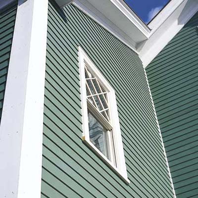
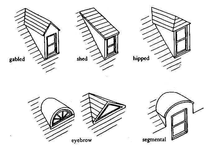
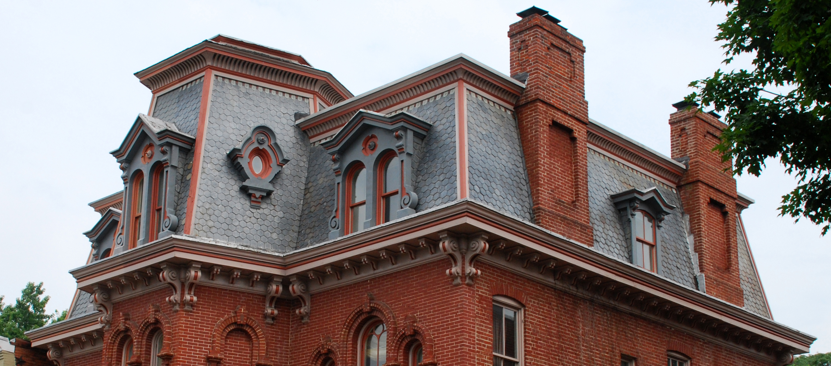
4. Dormer: The setting for a vertical window in the roof. Called a gable dormer if it has it's own gable or a shed dormer if a flat roof. Most often found in upstairs bedrooms.
5. Eaves: That portion of the roof that projects beyond the wall.

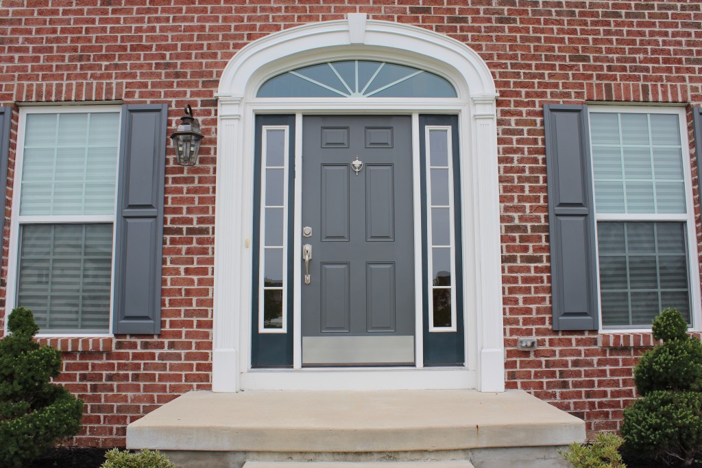
6. Fanlight: A semicircular or arched window above the door.
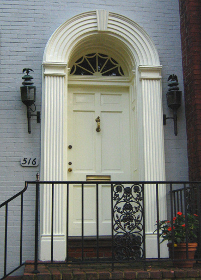
7. Palladian Window: A three part window featuring a large arched center and flaking rectangular sidelights.

8. Pediment: A triangular crown used over doors, windows or porches. A classical style.

9. Portico: A large porch usually with a pedimented roof supported by classical columns or pillars.

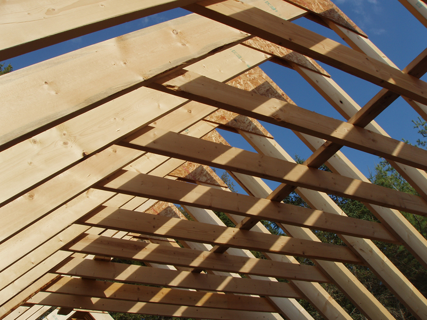
10. Rafter: A roof beam sloping from the ridge to the wall. In most houses, rafters are visible only from the attic. In styles such as craftsman bungalows and some "rustic" contemporaries, they are exposed.
11. Sidelights: Windows on either side of a door.
12. Turret: A small tower, often at the corner of a building. Common in Queen Anne styles among others. A turret is a smaller structure while a tower begins at ground level.

1. Bay Window: A set of two or more windows that protrude out from the wall. The window is moved away from the wall to provide more light and wider views.

2. Casement Window: A window that opens by swinging inward or outward much like a door. Casement windows are usually vertical in shape but are often grouped in bands.

3. Clapboard: Also known as weatherboard or siding. Long narrow boards overlapped to cover the outer walls. Used in Colonial style frame houses.

4. Dormer: The setting for a vertical window in the roof. Called a gable dormer if it has it's own gable or a shed dormer if a flat roof. Most often found in upstairs bedrooms.

5. Eaves: That portion of the roof that projects beyond the wall.

6. Fanlight: A semicircular or arched window above the door.

7. Palladian Window: A three part window featuring a large arched center and flaking rectangular sidelights.

8. Pediment: A triangular crown used over doors, windows or porches. A classical style.

9. Portico: A large porch usually with a pedimented roof supported by classical columns or pillars.

10. Rafter: A roof beam sloping from the ridge to the wall. In most houses, rafters are visible only from the attic. In styles such as craftsman bungalows and some "rustic" contemporaries, they are exposed.

11. Sidelights: Windows on either side of a door.

12. Turret: A small tower, often at the corner of a building. Common in Queen Anne styles among others. A turret is a smaller structure while a tower begins at ground level.

Wednesday, September 25, 2013
Roof Styles
Gable Roof: a roof with two sloping sides and a gable at each end.
Gambrel Roof: a roof with two slops on each side, the lower slop having the steeper pitch. Often found in Colonial revival houses in the 'Dutch' style.
Hip Roof: a roof with slopes on all four sides. The "hips" are the lines formed when the slopes meet at the corners.

Saltbox: a building with a long, pitched roof that slopes down to the back, generally a wooden frame house.
The International Market Square
The International Market Square, more commonly known as the I.M.S., is a building in Minneapolis where companies who sell products to interior designers and other people working on homes. The International Market Square was once a factory which was renovated to become the beautiful building it is today. It was initially a manufacturing facility for Northwestern Knitting, and later became the headquarters for Munsingwear Inc. (producers of a 'revolutionary' Union Suit). In 1985 it became Minnesota's largest renovated building, offering help with your office, kitchen, bathroom, lighting, windows, or fabric/textiles, they've got you covered.
 |
| Before Renovations |
 |
| After Renovations |
Tuesday, September 24, 2013
Summit Avenue, St. Paul
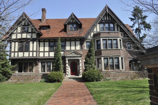
The people who lived on Summit Avenue were Minnesota's richest most elite families, buying up lots and building eccentric homes on them to one-up each other and prove who was wealthiest. The most common styles of architecture were Queen Anne, Greek Revival, and Tudor. My favorite houses were the Queen Anne style homes because they were all so decorative and beautiful.
^ Homes on/close to Summit Avenue ^
James J. Hill House; History Behind the House
James J. Hill (railroad magnate), who was at the time the richest man in Minnesota, owned the house and shared it with his wife and child. The house covers three lots and has one of the best views on the block. The massive 36,000-square-foot house was completed in 1891 with the designs of the well known architect, Clarence Johnston. The first floor had the art gallery, music room, hall, formal dining room, library, drawing room, and Mr. Hill's home office.
^ The grand staircase inside the Hill home. ^
Monday, September 23, 2013
Field Trip Summary
Last Friday our interior design class at Monticello High School went on a field trip to the James J. Hill house up on Summit Avenue in St. Paul. It was a full day trip and all in all, it was pretty fun. We made it to the James J. Hill house a little late because of some 'minor' setbacks. Despite said setbacks, we continued on with our adventure and did all that was planned for the day.
At the James J. Hill house we looked around the outside and a select few went inside for a bathroom break, including myself. The upstairs bathroom was full and had a fairly long line so a guide took us to a downstairs bathroom, giving us a sneak peak of the inside. It was pretty cool and exceedingly large.

After the bathroom break, a guide took us for a loop around the neighborhood to see the houses on and around Summit Avenue. All of the houses on the avenue were beautiful, eccentric, and unnecessarily large. The roofing was mostly slate or an approved slate substitute, because there are rules and guidelines protecting the history of the neighborhood. As soon as you aren't on the sloped side of Summit Avenue, the buildings become more reasonable and are mostly just upper class homes instead of elite houses.


The last place we visited was the International Market Square, a 5 floor interior design 'hub' in the words of Ms. Ambrosius. The I.M.S. has a history, unlike a lot of buildings in the cities. It was once a factory, and the city wouldn't let the owners tear it down to build a shiny new building to host their interior design needs, so they simply renovated it and rented out rooms like in some type of office building. People from all over came to rent an area to display examples of their company's work. Depending on the people, they could be open to the public including sales, open to the public but excluding sales, or closed to the public in general, only selling to interior designers (the 'trade'). We walked past a lot of places that were 'Trade Only', making it difficult to see if we liked their products or not.

The day was fairly enjoyable and much more fun and excitement than Geometry and History.
Friday, September 13, 2013
Apartment for Young Adult
This is the outside of a $590-$900 single bedroom apartment in Minneapolis for Young Adults. People just starting off in the world of independence and someone just starting to pay for their own living costs usually aim for something from $500-$900 because $1000 can be somewhat close to a house payment, and when someone moves into an apartment it's more than likely because of the price.

Thursday, September 12, 2013
Living That Suits A College Student
A good room for college students would include lots of space-friendly furniture, like bunk beds and possibly a futon for guests. The room below features a piece of furniture that takes up the floor space of a bed but includes the features of several different pieces. It includes a desk, bookshelf, vanity, and a bed.

Monday, September 9, 2013
My Mood Board
My mood board is full of color and picture frames! Oranges, pinks, greens, blues, yellows, you name it! I put these items into my mood-board because they are bright and colorful. PRICES; green pillow:$39, orange pillow: $25, Blue table lamp: $78, orange lantern-like lamp: $181 collection of picture frames: $30, rainbow picture frame clock: $40, tree picture frames: $80, white patterned pillow: $65, Green desk/vanity: $1,229, blue chair: $179, white chair: $769, 'family' painting: $199, brown 'change the world' pillow: $62, two silver side-tables-jewelry-boxes: $658 The total cost of this room would be... $3,634.

Subscribe to:
Comments (Atom)





.JPG)
.JPG)

