Bailey's Indescribable Interior Design
Friday, December 20, 2013
Thursday, December 12, 2013
Tuesday, December 10, 2013
Line and Its Effects
WALLPAPERS:
Vertical Line: I would use this wallpaper in a kitchen/bathroom/dining room.
Curved Lines: I would use this wallpaper as an accent wall in a bedroom or rec. room of some sort.
Vertical Line: I would use this wallpaper in a kitchen/bathroom/dining room.
Curved Lines: I would use this wallpaper as an accent wall in a bedroom or rec. room of some sort.
Friday, December 6, 2013
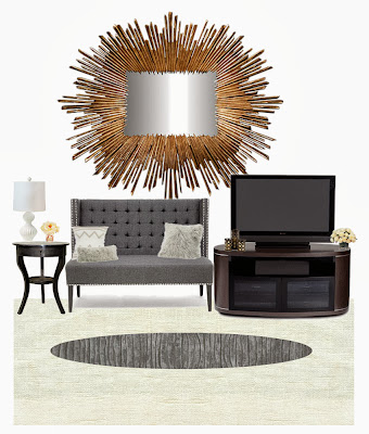
EMPHASIS: Mirror(s)
The emphasis was supposed to be on the mirror so I made the rest of the room with more muted, less noticeable colors and got the mirror that was bright, gold and shining.
Monday, October 14, 2013
Color Schemes in the Home
Monochromatic Color Scheme:

This room is a green monochromatic color scheme, with mixed in whites, browns, and blacks. The 3 other colors thrown in are the neutrals that give your eyes a rest. A monochromatic color scheme has a calming affect on the mind. You would use this in a place where people should be calm and at peace.

This room is a green monochromatic color scheme, with mixed in whites, browns, and blacks. The 3 other colors thrown in are the neutrals that give your eyes a rest. A monochromatic color scheme has a calming affect on the mind. You would use this in a place where people should be calm and at peace.
Analogous Color Scheme
This color scheme is analogous. Analogous colors blend harmoniously because they are generally related to each other. They are also related to each other in position on the color wheel. They usually have less contrast than complementary colors, lending a sense of peace.
Split Complementary
This is a split-complementary style office. They are more harmonious and a bit less loud than just two complements. They give just the right amount of contrast. They add interest but work together to bring out the greater qualities in each other.
Triadic
Triadic colors are more like complementary colors that are two instead of three. They are equal distances apart from each other on the color wheel. It offers strong visual contrast while retaining harmony and color richness using a limited color palette. The primary (above) and secondary colors are examples of this scheme.
Bailey Lundberg
Subscribe to:
Posts (Atom)


